About US Stock Map
Large Cap stocks and ADRs map w industry and sector categorization. Real time OHLCV, average volume, price strength, Volume momentum, price chart data. Two level Maps. .Stock Market Map from 600+ large cap US stocks and AD
Large Cap stocks and ADRs map w industry and sector categorization.
Real time OHLCV, average volume, price strength, Volume momentum, price chart data.
Two level Maps.
.Stock Market Map from 600+ large cap US stocks and ADRs traded in US markets.
.Intraday market data update every minute when stock market opens
.Two levels of map: Sector – Industry maps and Industry – Stock maps
.Performance (Gain), Volume, Average Volume and Index values on Sectors, Industries as well as individual stocks.
"Strength" measures strength of the price movement of a stock compared to other stocks of the industry or industries of a sector using real time data.
."Momentum" measures trading volume of a stock compared to its own average volume using real time data. Intraday volume strength compares average volume normalized to portion of time periods in the session.
.Colorful representation of gain and loss of indexes and stocks.
.Block sizes represent Market Capitalization of components.
.11 Sectors and 80 Industries.
.Intraday price chart (new feature in version 3) for all components - stocks, industries and sectors.
.Company fundamental data including market cap, earnings, dividend, price target, ... and much more.
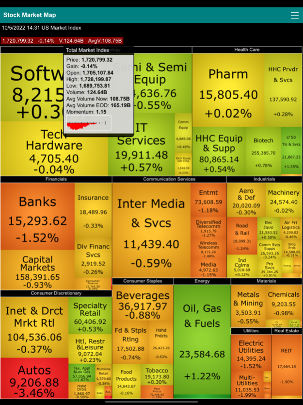
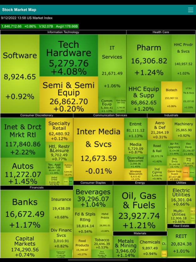
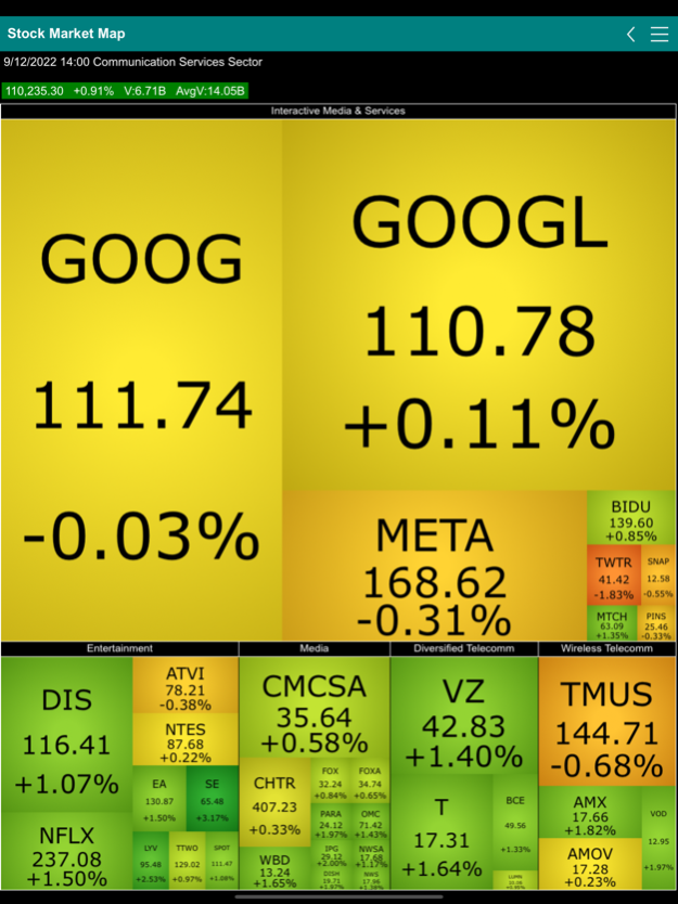
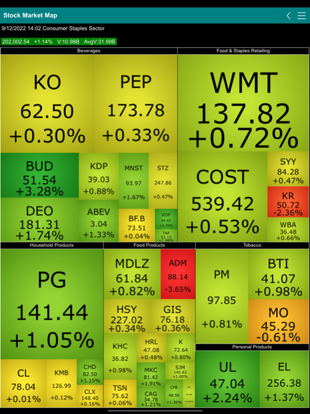
Stock Market Map (a.k.a. market heat map or market tree map) is a visual representation stock market data. This specific map categorizes 600+ stocks and ADRs with largest cap. into sectors and industries. Top-level map consists of sectors of the entire market and all the industries under each specific sector. 2nd-level map starts with a sector and includes all industries and individual company stocks under the industry. It lets you quickly view the performance of sectors, industries and individual companies. The size of the block in the map represents the values of the component (stock or industry) within the portfolio of its parent (industry or sector). The color of the block represents the daily price movement of the component. The overall performance of the entire stock market and/or individual sector can be easily grasped by a glimpse to the map by the color and size of the blocks.
Tapping a block brings up a popup box showing the name, daily closing price, daily gain, daily volume and the 13 week average volume of the sector, industry or individual stock. For stocks there are also the strength and momentum data tracking the short-term strength of the stock compared to other stocks in the market as well as the volume momentum of the price movement. The name of each component is labeled on top of each block. Double tapping any block from the top-level map navigates to the second-level map of the sector that the block belongs. Tap the back button on the title bar or the back button on the mobile device to navigate back to the top-level map.
Real time market data.
The prices, volumes, average volumes and other information of sectors and industries are calculated by BullLabs.com. Indexes are calculated based on the market capitalization of the underlying components (stocks or industries) in the level.
Sector and Industry specific indexes allow investors to benchmark the performance of investment based on specific stock market sectors or industries. Just as all stocks tend to move based on the underlying factors that drive the overall market, stocks in a similar industry tend to move based on underlying factors that affect the industry. One of the most basic methods for understanding the risk of an investment portfolio is to determine its sector breakdown. Is the portfolio spread across different industrial sectors or is it concentrated in just a few? This provides a good indication of how an investment portfolio will respond to macroeconomic factors or industry trends.
Company fundamental data include Market capitalization, outstanding shares, EBITDA, PEG Ratio, Dividend per share, forward and trailing dividend rate and yield, dividend payout date, ex div date, P/E, trailing and forward PE, price/sales, short ratio, book value, price/book, price target, current and forward EPS, EPS report date, EPS ttm, Basic EPA, Diluted EPS, High/Low EPS estimation, number of analysts.
Oct 6, 2022
Version 3.5.0
Includes “Average Volume Now” for showing intraday volume average at any specific instance of a market session.
Shows popup box showing detail numbers when the summary line (the top-level index or sector) is tapped.
Previous Versions
Here you can find the changelog of US Stock Map since it was posted on our website on 2023-09-07 09:16:38.
The latest version is 3.5.0 and it was updated on 2024-04-22 22:00:05. See below the changes in each version.
US Stock Map version 3.5.0
Updated At: 2022-10-06
Changes: Oct 6, 2022
Version 3.5.0
Includes “Average Volume Now” for showing intraday volume average at any specific instance of a market session.
Shows popup box showing detail numbers when the summary line (the top-level index or sector) is tapped.
Disclaimer
Official App Store Link
We do not host US Stock Map on our servers. We did not scan it for viruses, adware, spyware or other type of malware. This app is hosted by Apple and passed their terms and conditions to be listed there. We recommend caution when installing it.
The App Store link for US Stock Map is provided to you by apps112.com without any warranties, representations or guarantees of any kind, so access it at your own risk.
If you have questions regarding this particular app contact the publisher directly. For questions about the functionalities of apps112.com contact us.